Thursday, November 05, 2009

Showreel 2006

Hey Y'ALL

THIS IS AN APPEAL FOR ANYONE TO HELP ME GET MY MAYA BACK ON TRACK!!!

HERE ARE SOME SAMPLES OF UNFINISHED WORK YOU COULD BE ENJOYING.......IF YOU COULD HELP ME:


Starry night shared by Father and Son:


obviously the lighting is terrible.....but its not done, so have mercy....any tips welcome!!

Or this cute forest scene ......sorry didn't render a maya scene sample BUT IT WASN"T DONE:


Or this animation STILL UNFINISHED:


this could look so cool!!!


Lastly,
Here's my showreel from 2006 which I've uploaded again, just for fun...

I would really like to update this thing (hence the appeal)......
Afterall It's for your own viewing pleasure!!!!!!


Ps: in the last video I only animated the guy, not the octopus or anything


I wana sleep.....I don't like maths now!

Tuesday, November 13, 2007

Forest n Sapling

Hi There! This is some work I did over the Summer using Photoshop aiming for the 50s kinda look:


I don't like the color of the grass anymore, I'd now like it a deeper darker old green, not to mention a more solid texture. I also think the texture of the foreground tree crowns is too messy.
Initially it was supposed to be a long picture, where u can see underground that the sapling is taking its juice from an old TV burried underneath. I never came round to finishing that version, but have a look:


Until next time :)

Friday, February 23, 2007

Blendshapes

Ok, don't mean to keep anyone waiting, so here is a screenshot of the final blendshapes on the smoothed head. Isn't it like MAGIC!?!?


So now I'm off to skin him and paint weights and color him in. Wish me luck!

Saturday, February 03, 2007

Modelling

At the moment I'm working on a CG lipsync project to add onto my showreel to boost my opportunities in becoming a character animator.

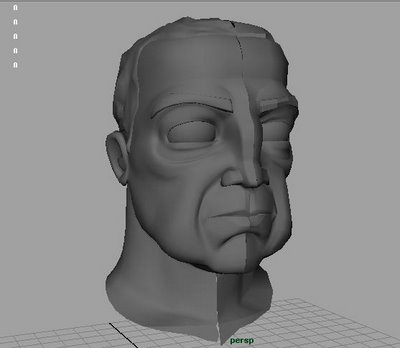
Here is 1 of 2 characters, a guy named Steve. It will all make sense as I keep posting!
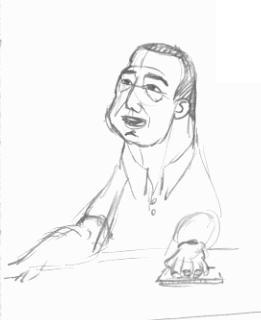
This is the transition from original sketch concepts to the final model:

I had a lot of fun drawing the face expressions that I thought this person should be doing. It's alien and a real thrill.


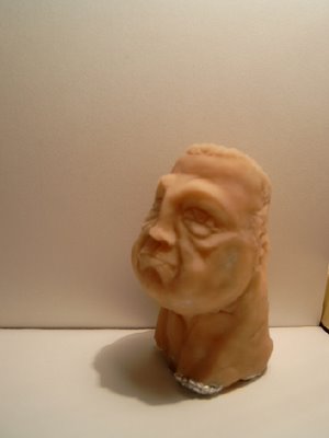
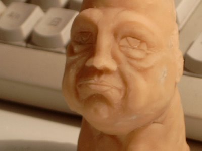
Then I made a SuperSculpey model to feel the shapes that I want to translate from drawing onto CG:


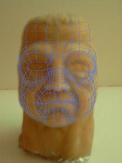
and drew topologies over the top till I found one I thought I could work with:


And here is the final product.
I'd like it more cartoony and chunky, but I tend to lean towards realism. Still, I'm quite happy to work with this for this animation:

I would like to take this opportunity to Thank Uli for letting me use his resources !!!

Monday, January 08, 2007

color and things

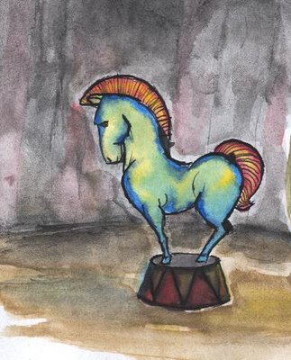
Ok, here is more of these watercolor circus animals. I actually wanted them to all be sort of weird-cute but when I drew the horse he just didn't go cute, just sort of weird!


I wanted to color it in so it looked sort of 19th century pompous and flamboyant and then remembered Marilyn Manson's art.
I overdid the colors and so killed the horse's little podium and flattened the horse's colors too. I thought an environment for the horse would be nice but NO ...NOT NICE :( ! Whaddayathink?


Sunday, January 07, 2007

New Blog

Hey Guys!

Happy New Year and Merry Christmas!

As my title says I made a new Blog for all the photos I take.

http://deggerpics.blogspot.com

I've already put up a post for Part 1 of my just gone by holidays. Hope you Enjoy and please do drop a note!

Saturday, December 02, 2006

Color 2

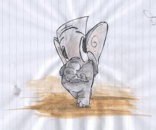
The 2 and a 1/2 D Elephunt that could never be animated:


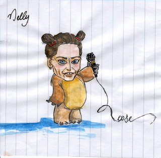
A Nelly F. CD cover I made for my swish (my sister). This is a 2am creation; you'll soon discover that most my art created at 2am is rather strange.
And NO Nelly is not wearing blue knickers under that bear suit and did NOT wee herself!! Some mistakes on the face shading but I paint and learn, eh!?


My first rather embarrassing attempt at Photoshop. The background is totally inappropriate in style. BTW this is a concept for my current film No Title (havent thought of a title yet) for which I'm currently preparing a blog to keep you updated with the currency of something GO AWAY:


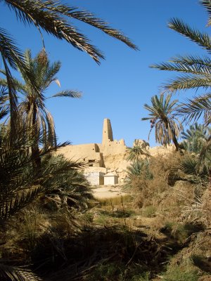
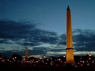
A photo I took of Place de la Concorde (did I get that right?) in Paris, Summer 2005.


Here is a lo-poly car I made in Maya for Uli Meyer's MonsterMania Animatic (I nicked the still from his blog: http://umbackagain.blogspot.com/ )


I'd really appreciate some criticism, so come on and fling them pies!!!